
This morning, I read 2 very informative articles on clark.com. For those who haven’t followed closely, Clark Howard is my favorite cheapskate.
I was first introduced to Clark on my favorite podcast. He talked about a few ways to save money. The one I remember most was his advice to use a shaving razor blade for 7 months.
I was listening in the car and almost swerved off the road. 7 months??? Gillette tells us to switch every 2 weeks. But then again, they’re the folks selling the blades at 5 bucks a pop.
Clark recommended rinsing and drying the blade after each shave. I got 9 months out of my first attempt before my first nick.
Do Stocks Always Win Over the Long Term? Let’s Check the Math
I love this chart.
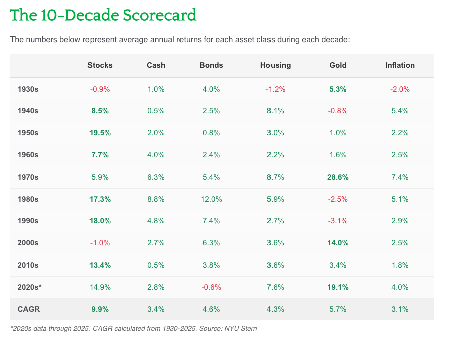
I’ve shown the returns by year, but never done a decade-long look.
We see some decades performed better than others, and the great depression and the 2008 financial crisis knocked out a full decade off stock returns, but overall we see a 9.9% stock return which beats other asset classes.
1 Pet Peeve
Nowhere in the article (unless I missed it) do I see a note about which stocks. Do these numbers represent the S&P 500, world stocks, or some other basket???
I’m going to guess that it is the S&P 500. Because that’s a pretty common benchmark and the 9.9% CAGR, along with the “when stocks fall” data seems to align.
This is important because while the S&P 500 has been pretty reliable in the long-term, we can’t just pick a group of stocks and expect the same returns.
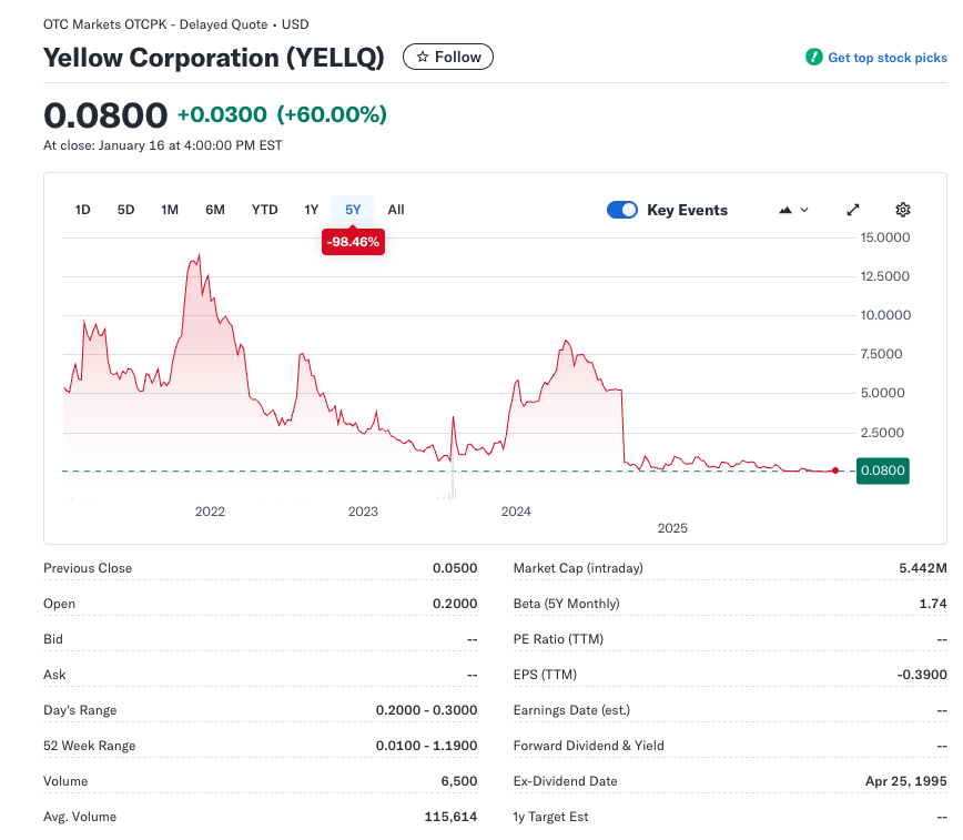
I bought trucking company Yellow at one point. It went bankrupt. It still trades under YELLQ, but it is unlikely that any holding period will make this a winner.
A Jack Bogle Lesson: Remember Reversion to the Mean
2 interactive charts.
Asset class returns – we can see over the past 10 years what the return was for each asset class. Often one year’s winner is the next year’s loser.
This is an important lesson. It’s easy to read the hype about this year’s hot asset class, stock or mutual fund. We don’t want to miss out so we react and more often than not, in the not too distant future, we’re behind. This is a recipe for buy high and sell low.
S&P 500 Sector Return
Here’s an important lesson.
This chart shows us that owning an S&P 500 fund is a pretty good choice.
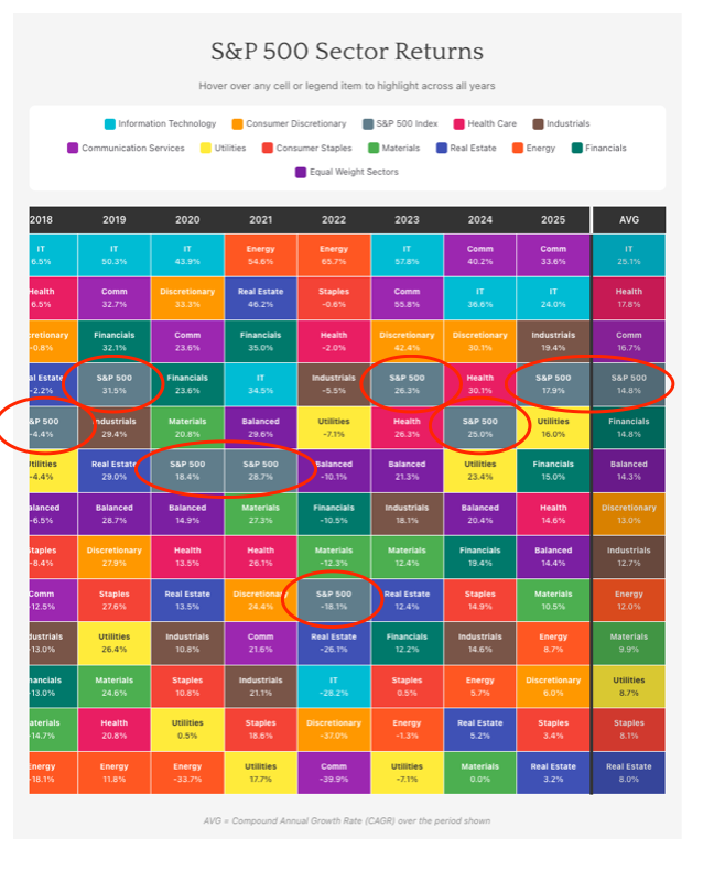
It’s only in the bottom half of the chart once. On average, it’s in 4th place. Pretty solid.
Neighbor Mike and his wife were over for dinner the other night and we were discussing whether defense was a good sector to be in these days. It certainly seems like a good choice.
And defense is generally a good choice. Until recently, it has been the biggest line item in the US budget. It was recently surpassed by debt payments. There’s talk of increasing US defense spending, and with all the stuff going on in the world today, it seems like a good bet.
But who knows, an unfortunate outbreak of peace could shoot down our investment.
Picking sectors is tough. We tend to focus on what’s hot today. Human’s aren’t great at projecting out into the future.
That’s why an S&P 500 fund is such a great pick.
Wrap Up
Kudos to Clark for 2 fantastic articles.
And click on the links – especially the 2nd one. The interactive charts in the reversion to mean post are great.
Thanks Clark.